A dental website at its best should reflect your practice personality and tell your story well. Whether you are starting a new website from scratch or giving your current one a makeover, it helps to look at other websites for inspiration.
Why do dentists need a website? Patients often begin their search for dental services online. When they cannot find you, it is almost as if your practice does not exist. The more saturated your local market is, the more you need a high-quality website central to your dental marketing.
It is always smart to have a look at competitor websites. Not only look for ideas but also to make sure yours does not end up looking too similar. But before you do that, have a look at three dental website examples we love.
3 Excellent Dental Website Examples
As someone who plans to renovate their home would look online for inspiration, That is why we chose these modern dental website examples with enhanced functionality and quality website design to share with you. We hope they will inspire and motivate you to get started on a bold new website design your patients will love.
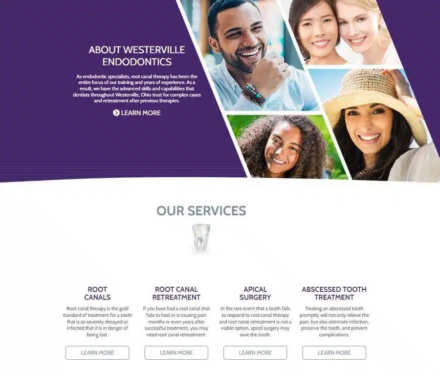
Westerville Endodontics, “is a specialty of dentistry focused on preventing and treating problems of the dental pulp,” One patient remarked that this practice offers, “very thorough and competent treatment, plus unexpected comfort aids such as a blanket and glasses.”
Why this website is a great dental website example. At the top, patients can find a logo and tagline that immediately communicate what the practice is about. Also at the top are the request appointment, patient forms, and phone number buttons.
“What is an Endodontist?” is a question this practice probably answers frequently, and here we have that as a menu bar option. Also offered here are the providers, services, and financial options buttons.
Bold purple dominates this simple color scheme. Geometrical features and perfect spacing gives this site a clean look and welcoming layout.
Faber Dental Arts – Ottawa & Shorewood, Illinois
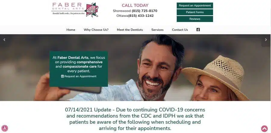
With two dental office locations in Illinois, “At Faber Dental Arts, we focus on providing effective, comprehensive, and compassionate care for every patient through preventative and personalized treatment plans. We are a general family dentistry practice, which means we treat kids, adults, and senior citizens for a wide range of conditions that affect oral health.”
One of the patient testimonials showcased on the homepage shared that the, “staff is helpful and engaging on a personal level, always professional, and seems genuinely concerned for a positive patient experience.”
Why this website is a great dental website example. This dentistry brand has a distinct color scheme and an artsy logo to match the practice’s name. Again, we have the tagline of the brand integrated into the logo. The navigation menu is clean and simple with all the basics patients are looking for in plain sight: “Why Choose Us,” “Meet the Dentists,” “Services,” etc.
As you scroll, you get the rundown of everything they have to offer, plus before and after photos that may encourage those who are ashamed of their teeth to move forward in the process.
Dr. Ernie Soto – Plantation, Florida
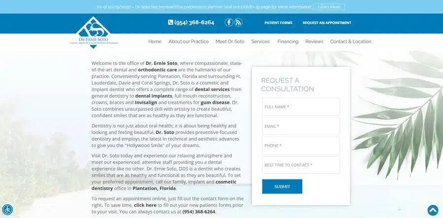
Located in Plantation, Florida, “The Dental Office of Dr. Ernie Soto is as concerned about your comfort during your visit as we are about providing you with the best in dental care. We realize that many people avoid going to the dentist because of fear. Dr. Soto is passionate about helping people with dental anxiety receive the dental care they need.”
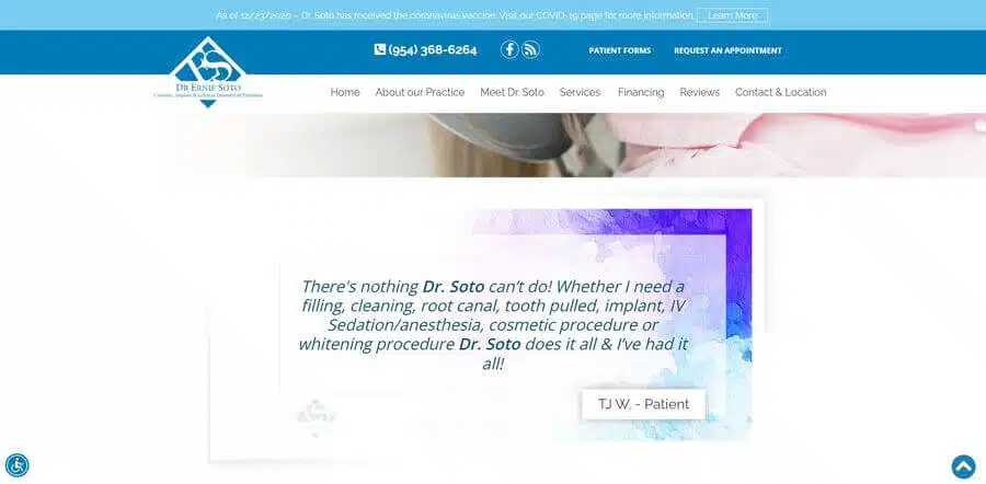
One patient writes, “I went to Dr. Soto’s office very reluctantly, as I have a terrible fear of the dentist; which has contributed to the current state of my dental health, unfortunately. I was in terrible pain, I made the appointment, and I am so happy I did! What an incredibly empathetic, professional, and efficient team.”
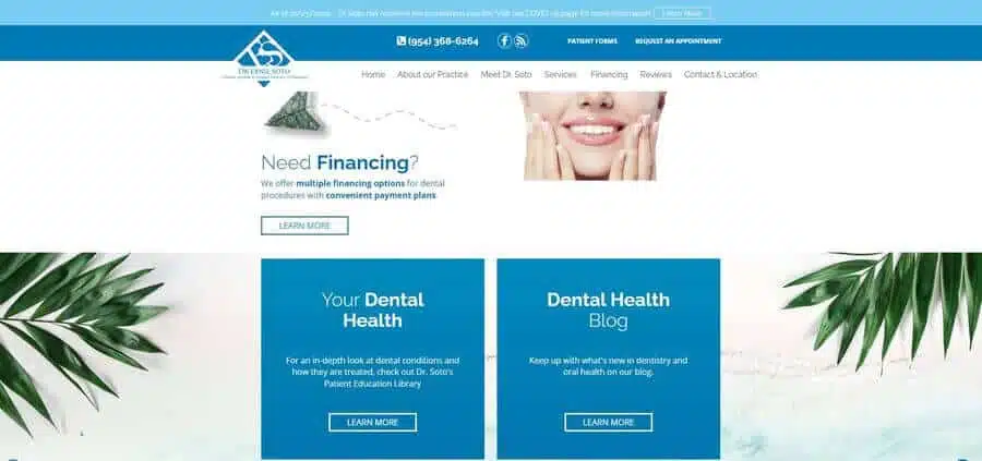
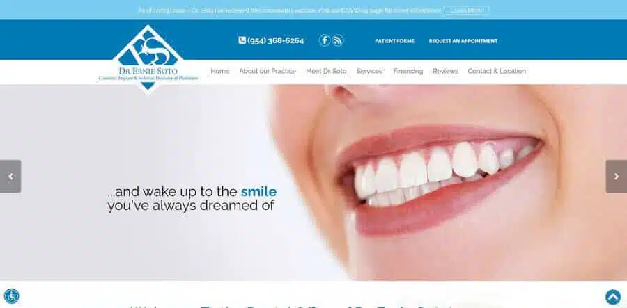
Why this website is a great dental website example. While here we see a rather conventional layout and commonly used color scheme, the website’s homepage does make a great first impression with a clean look and a Floridian vibe.
Once more, the logo couples with a brief tagline letting the patient know what this practice is about. All the good stuff is up at the top including the phone number, Facebook link, patient forms, appointment request form, COVID update, and then the menu bar with information about the dentist, the practice, services, and financing.
The mission of this practice is to make the dental experience more comfortable, and they cut right to the chase with messaging in the banner slides that read respectively, “Are you afraid of the dentist? Visit Dr. Ernie Soto today! And wake up to the smile you always dreamed of. We are open for ALL patients.”
As you scroll down, you find the appointment request form embedded into the page, information about sedation dentistry, a complete list of services, financing information, featured reviews, and links to educational resources.
Now that we have seen some dental website examples, let’s go over what makes a great dental website by explaining what a website needs to attract patients and make an impact.
Patients often begin their search for dental services online. When they cannot find you, it is almost as if your practice does not exist. The more saturated your local market is, the more you need a high-quality website.
What Makes a Great Dental Website?
What should be on a dental website? Fundamentally, a dental website should help patients make informed decisions concerning their oral health. It should provide answers to all their many questions such as:
- Services provided
- Special qualifications, certifications, or special recognitions you hold.
- Available payment options or arrangements.
The best dental practice websites should also have a modern appearance and optimized functionality.
Clean and Attractive Website Design
You may occasionally stumble upon a website with an old design, where it is easy to notice the stark difference compared to today’s clean and intuitively formatted appearance. Website development has shifted toward user experience (UX) principles focused on simplified design.
Old web design was far from mobile-friendly. You had to scroll off screen to find what you needed, and pushing tiny buttons was a pain. Modern websites are responsive, meaning they will automatically adapt to the device being used: desktop, laptop, tablet, or mobile phone.
Modern websites also have improved aesthetics such as high-quality images and a well-coordinated color palette. The modern layout coupled with enhanced visuals is now standard practice. Consumers will judge a brand based on how its website looks, so you want yours to have a fresh look and engaging features. Having a modern website design is one step to creating the best dental website possible.
Ease of Use
Modern website design is intuitive, and so should your website aim to be. Patients should be able to easily find the information they need and take advantage of site features. So, you should position the most pertinent items at the top of the page, and ensure your homepage has everything a patient may be looking for.
For example, old web design had the phone number at the bottom of the page or nestled into the “Contact Us” page. Moving the phone number to the top of the page makes it so easy for patients to call you. Also, the “click-to-call” feature allows mobile users to tap the phone number then it automatically copies over to the mobile dialer. This means patients can call you in just a few clicks.
On that note, a website that is easy to use on mobile phones can only help your practice recruit potential patients. The number of patients relying on a mobile device to seek out dental services continues to be an upward trend. When you make it easy for them to contact you and request an appointment online, you will get them in the door that much sooner.
Give Potential Patients a Clear Call to Action
Once website users land on a site, they respond to cues that direct them while on page. These “call to actions” (CTAs) should be short, to the point, and prompt visitors on what actions to take next.
For example, when a website includes a new appointment request form, rather than label it, “this links to our patient request form tool,” the button instead reads “Request an Appointment.” The patient will know that once they have gathered enough information about your website that this is where they will click to get started as a new patient.
Dental Search Engine Optimization
Revamping your dental website design is also an opportunity to increase the patient attraction factor. On many levels, high-quality websites have a much better chance of appearing in search results. Making tweaks to appease Google’s quality standards is called search engine optimization (SEO).
Google is the most used search engine on the planet. To win its favor for search placement, your website must send the right signals of user value to Google’s automated web crawlers:
- Fast loading: Users have no patience for websites that load slowly, and Google will avoid sending people to sites having speed issues.
- Ease of use: Google can tell which websites provide a good user experience. Is your site easy to navigate?
- Organized: There is a protocol for how pages are organized. Google does not like to see a lot of broken links and it expects a website to be configured to standard. When you don’t have your website laid out in the way Google expects, automated crawlers could very well register your website as being lower quality than it really is.
Much of this is highly technical and would require the assistance of an SEO specialist. If you feel your website traffic should be better than it is, consider reaching out to an SEO expert.
- Keyword optimized: If you want Google to drive your target audience to your website, Google must learn to whom your site is most relevant. To do this, keywords your prospects would enter into search must be included in the right places on your website. Knowing which keywords to use and how often to repeat them usually involves sophisticated analytics that an SEO expert can research for you.
- Fresh blog content: Publishing new and original blog content monthly reminds Google that you are still there and actively engaging your audience. Choose topics that patients search for most (determined by keyword research) and have vetted writers – ones who are familiar with the dental field – create and edit your blogs.
Take Away Summary
When you know it is past time for a dental website change, it is helpful to look at examples of other dental websites. A modern design that enhances your brand colors and is easy to navigate.
While a modern and impressive appearance is the priority for dental web design, it isn’t everything. Once you initiate the website redesign process, this is also an opportunity to ensure the quality of your website. Ask yourself:
- Is your website easy to use?
- Does it have the information new patients seek most where it is easy to find?
- Are the call to actions clear?
- What specific website improvements are necessary to win Google’s favor (so you can rank on page one of search results)?
Be Our Next Best Dental Website Example
These dental website design examples are all iHealthSpot clients. We have enjoyed helping them reach their goals and presenting their brand in the best light. We are one of the few dental website design companies to offer comprehensive services including:
- Either template or custom websites for dental.
- Logo design
- SEO expertise
- Dental website content writing, including blogs.
Curious about how your current website stacks up? Go to our main page and enter your website address for a free dental website analysis!


